Logo Redesign
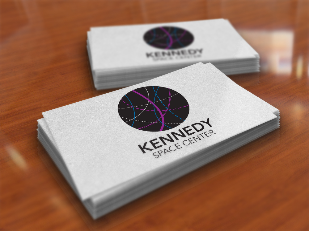
OBJECTIVE
Redesign a logo to make it more modern and appeal to a wider audience of any company on a given list. I decided to redesign the logo of the Kennedy Space Center in Florida.
SOLUTION
I decided to create something that represents the universe. The lines in the circle represents stars, comets and spaceships crossing through space. When choosing colours, I wanted to make it galaxy related colours so I went with black, white, purple and blue.
Music Set
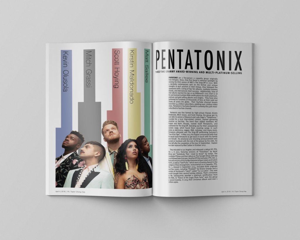
Double Page Spread 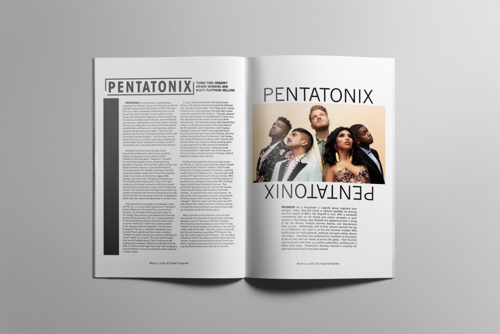
Body Copy and Photo 
CD Cover 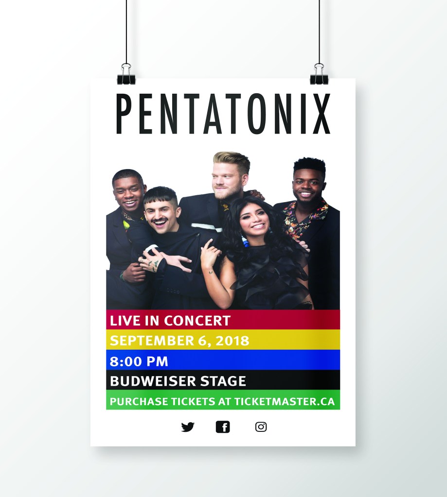
Poster
OBJECTIVE
Choose a musician or group and design a promotion set. I decided to choose the acapella band called Pentatonix. The music set consists of 3 single page articles and double page spread that people would see in a magazine, a poster and a CD cover.
SOLUTION
I wanted make my designs have a photo of the group on it as well as the colours the represent the band. For the double page spread, I incorporated the names of the band members in the lines.
Book Redesign
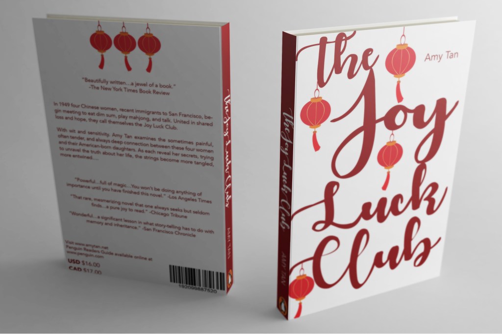
Back and Front Cover 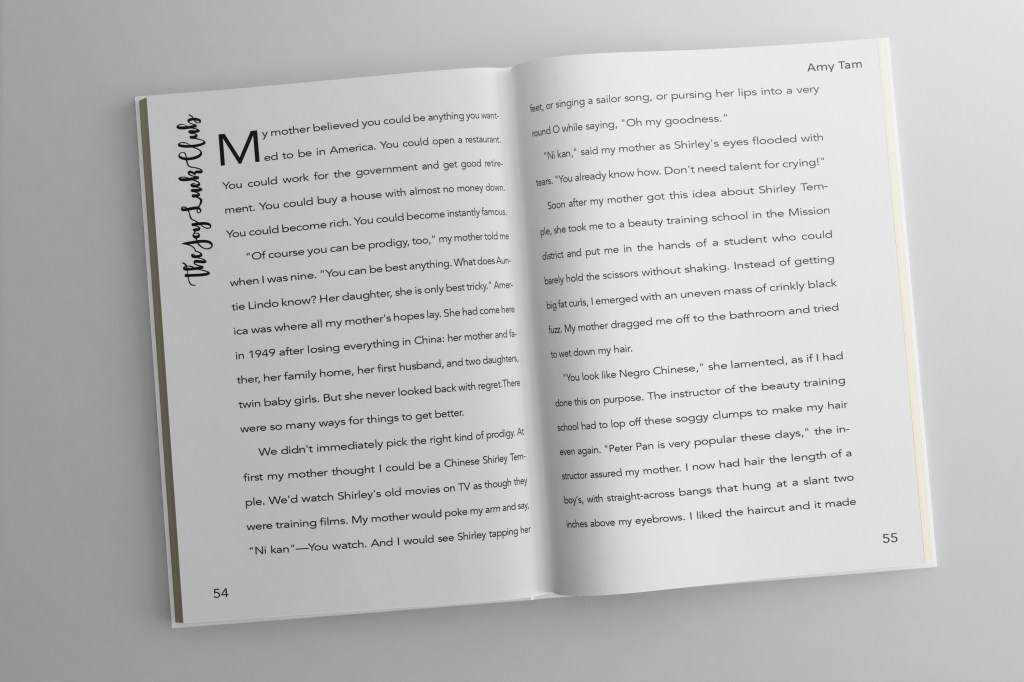
Book Pages 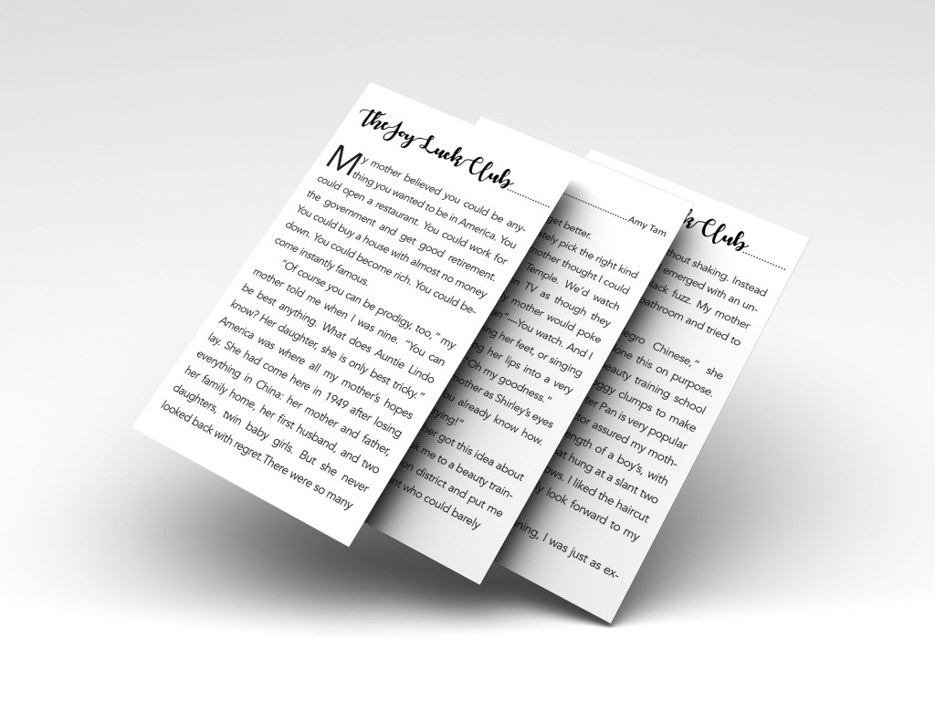
App
OBJECTIVE
Redesign an existing book cover and redesign the front and back cover, the inside text and also a iPhone design of the text. The book I decided to do is the Joy Luck Club by Amy Tan.
SOLUTION
I wanted the cover to have big type and have Chinese lanterns to reflect the Chinese herritage from the story. I decided to use a script typeface because when I was choosing a typeface for the front of the book I liked the way the script typeface looks and how it goes with the lanterns.
Wayfinding Design
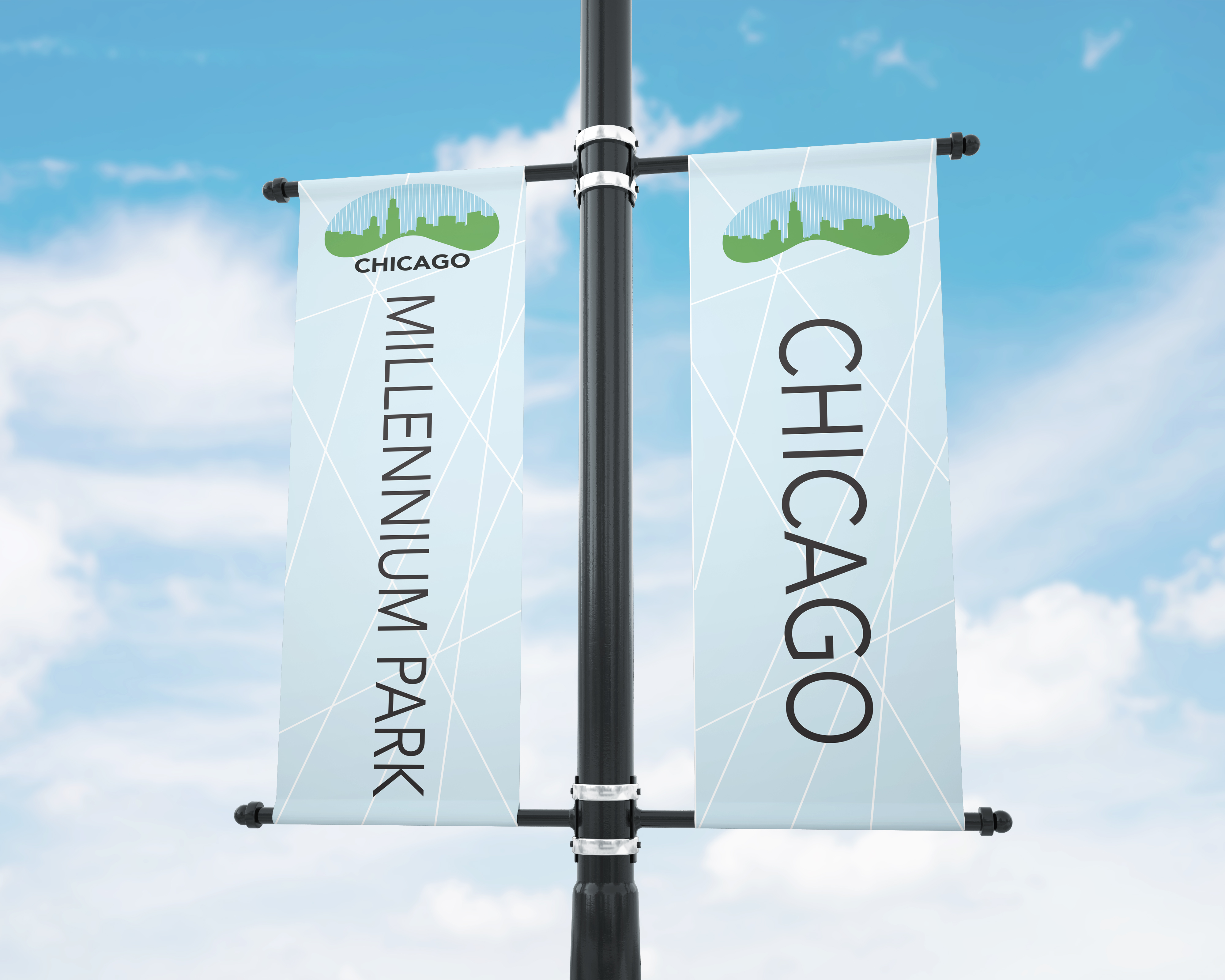
District Banner 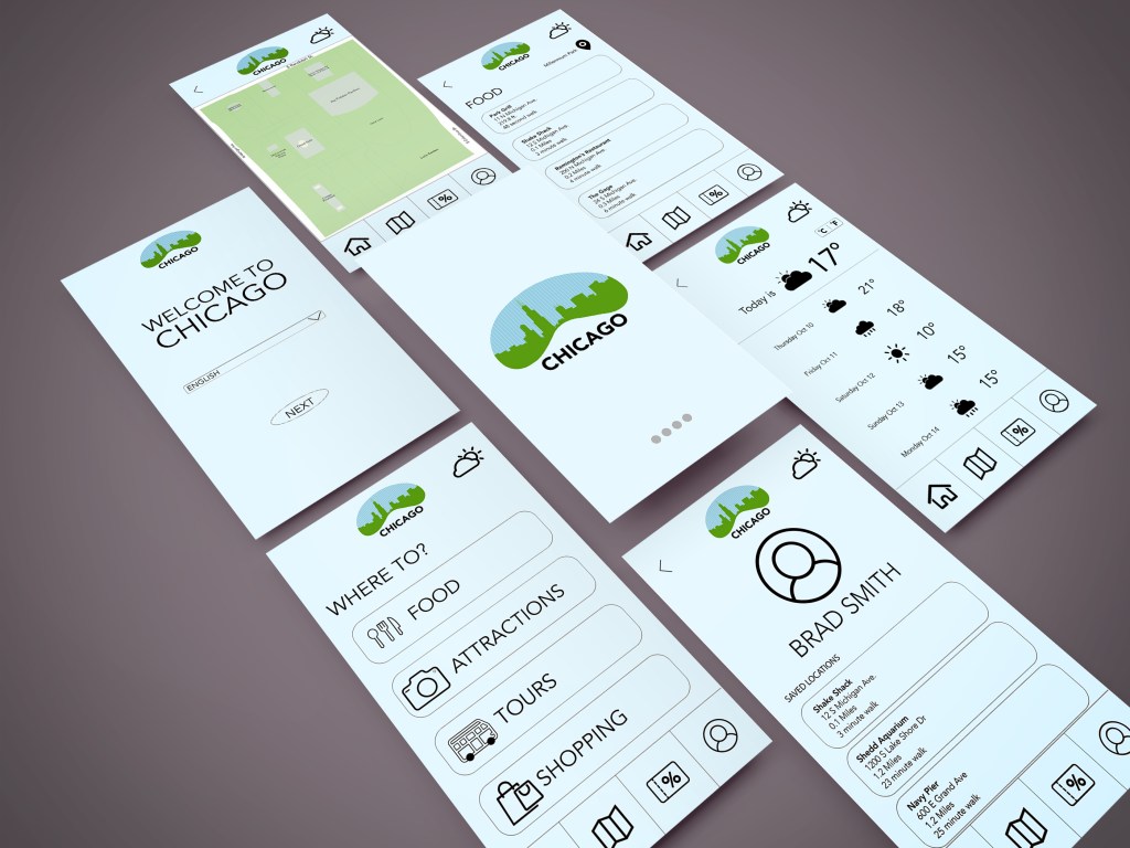
Wayfinding App 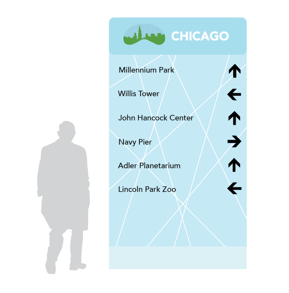
District Directional Sign 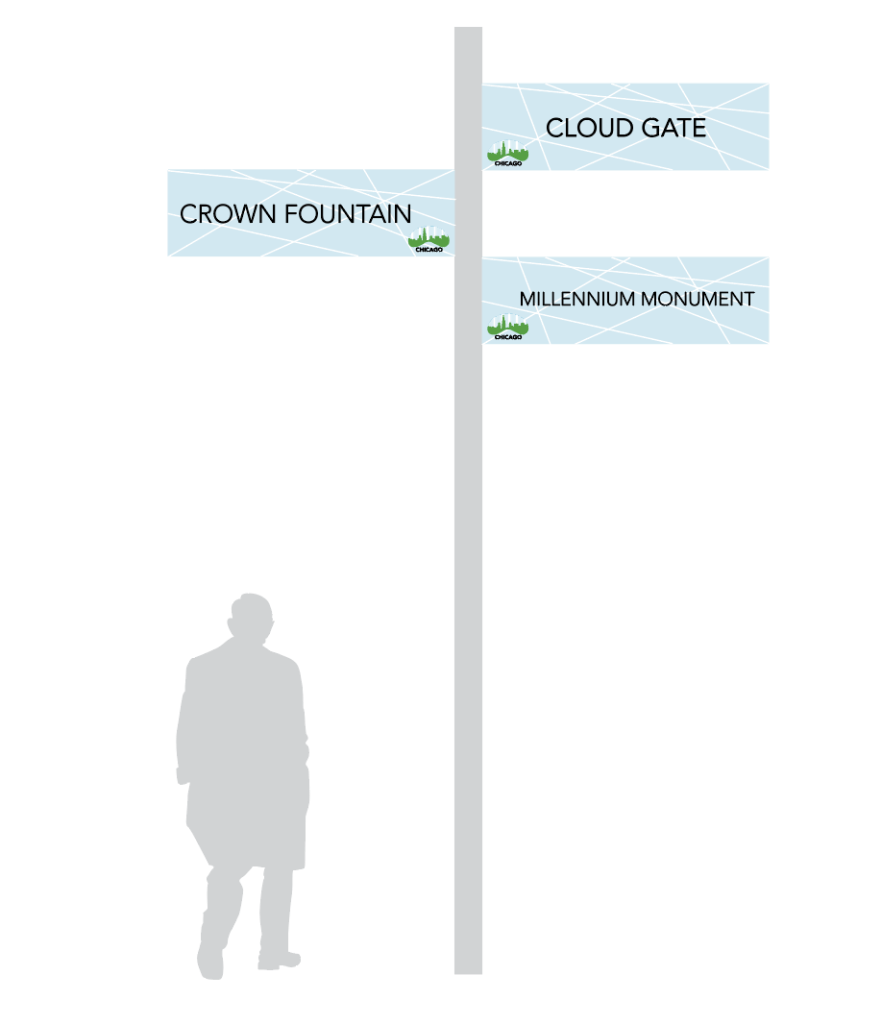
Pedestrian Directional 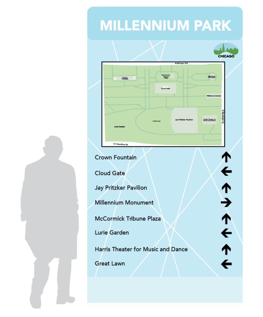
Map Directory 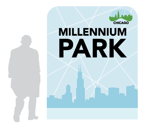
District Entrance Sign
OBJECTIVE
Redesign the logo and wayfinding signage of a city. The wayfinding signages consists of a district banner, district entrance and pedestrian directional. We also had to create a wayfinding app for a phone which help tourists get around the city.
SOLUTION
When creating the logo I wanted to have the bean sculpture that is in Chicago with the city skyline inside. To add more texture to the negative space, I added lines. To keep the lines consistent through the rest of the designs, I added lines going different directions on the wayfinding signages.
